An online presence is critical to election success. President Barack Obama proved that in 2008 and again in 2011. Candidates can be outclassed by opponents who run a better on-line campaign. Voters looking for information on a candidate will be turned off by the lack of readily available information about the candidate.
 |
| Barack Obama's "Home" Page |
When "New Media" is used to leverage "Old Media", we have a very powerful force. It's next to impossible to cram everything you want into an 8 1/2"x 11" brochure or a 4"x 6" rack card. If you do, key messages are lost and you end up with a useless piece of paper. The structure of a website ...... separate pages for separate topics, navigation buttons, photos, videos, graphics, links to other forms of online media ..... becomes a very powerful communication tool when it's connected to "Old Media". That little URL at the bottom of a pamphlet can be very powerful.
 |
| Here's an example of how NOT to write a brochure/rack card. |
Once upon a time, advertisers had 30 seconds or less to communicate their message - the "30 second sound-bite". Today it's less than that. People cruise the Internet at 10,000 miles an hour. You have less than 3 seconds to capture their attention.
Don't believe me? Watch a YouTube video that has an ad tacked on to the beginning. You can hardly wait the 5 seconds for that "Skip Ad" button to appear. You start to get antsy at the 3-second mark ...... unless ...... unless ..... the ad immediately catches your attention.
You therefore have to have a website that:
- Catches their attention
- Convinces them to stay
- In less than 3 seconds.
- Who is Cathy Candidate?
- Why should I vote for her?
The Party Leader & The Local Candidate
In Canadian politics, we don't elect a leader at the provincial and federal level. We elect a local candidate who represents a political party. The party with the most elected candidates gets to form the government and the leader of that party becomes the Premier or Prime Minister. And in most cases, the local candidate is unknown to voters.
While party and party leaders have a great influence on which local candidate the voters will elect, the local candidate can also influence the voter. In some cases this can be IN SPITE OF the influence (particularly if it's negative) of the party and the party leader. In today's world, it's not always a good idea to depend on the charisma of the party leader or the party to carry the day. And yet that is where a lot of election effort is focused.
 |
| Note how the leader's values are very clearly expressed across the top of the webpage. |
- We elect local candidates - not the national leader
- The local candidate is an unknown entity
- They don't have access to professional website developers
- You have less than 3 seconds to capture my interest
Before You Start - What Are Your Website Objectives?
It's your campaign message that will determine whether you win or lose. A voter who is looking for information about a candidate will expect to see:
- Who are you?
- What are your values?
- What is your position on issues that matter to me?
- What makes you better than your opponent?
- Why should I vote for you?
- What makes you better than your opponent?
- Why should I vote for you?
- Who is Cathy Candidate?
- Why should I vote for her?
- What is her position on key issues.
Who Are You?
Who you are is probably the easiest for you to define simply because it's what you're most familiar with. It's your biography of what you have done in the past that qualifies you to be the local candidate. Voters DO compare biographies so make sure yours is substantial. You can't be all things to all people. Follow the Pareto principle ..... the "20-80" rule ....... 20% of your effort will produce 80% of the impact.
It's not good enough to simply bullet-list what you have done. And please don't copy-and-paste your resume onto the webpage. It ain't gonna cut the mustard. You need to tell people a story about yourself. A story ....... a true story ........... that will give them reason to vote for you.
Select those 3-4 adventures in your biography that will give you that 80% impact. Remember, you aren't writing for YOU. You are writing for THEM. When putting pen to paper, always keep this in mind ........ it's THEM you want to influence, ........ not YOU.
What Are Your Values?
Values are a little more difficult to define. Values are your core convictions, principles, passions, your fundamental beliefs, the standards by which you make your decisions. Values are an expression of your moral view of life and the environment around you. You communicate your values through words, pictures, symbols, action, by what you choose to highlight in your biography. Values let people know what makes you tick and whether they can trust your judgement.
Voters don't care about you. They care about what you are going to do for them. Are you grounded by the same fundamental beliefs and convictions of those you seek to represent? Do you care about the same things that they do?
The best way to do this is through your values. Failing to communicate your values leaves a void in the minds of voters. It paints you as being out of touch. If you don't tell them, you can be sure that your opponent will do it for you. And it won't be pretty.

Put pen to paper and start thinking. What are your values?
Biography, Values and the Five "Character Factors"
In a previous post, we pointed out that, in 1980, Richard Wirthlin, Ronald Reagan's chief strategist, discovered that people vote for a candidate not primarily on the issues, but on five other very important factors - the "Character Factors":
- Values - the heart and core of a person;
- Authenticity - does what they say really reflect their values?
- Communication and Connection - a leader touches a heart before they ask for a hand;
- Trust - can I trust you??; and
- Identity - all of the above that results in an identity where the whole is greater than the sum of the individual parts. Difficult to describe in words but you know if it's there or if it's not there. More along the lines of a "picture" or a "frame"
Webpage Writing Tips
Writing for a website is different than writing for print. Copying your campaign print material onto your website won't do it. Nobody likes scrolling through pages and pages of poorly written, overblown website content. Language is crucial. Values, experience, and issues need to be crafted in easy-to-understand statements, limited in scope but very ambitious. Follow the KISS principle - "Keep It Simple, Stupid".
If you have difficulty using a keyboard to compose your thoughts in an ad hoc fashion, don't start writing your content on the webpage. Put pen to paper and write out your biography, your values, and your stand on key issues. You'll have a whole pile of paper on the floor before you finish. Transfer your words to your word processor.
It can be very difficult to start writing from the beginning. You might find yourself staring at your computer screen with the frustration growing and growing. Getting started with those first few sentences can be very difficult. Don't start at the top. Start in the middle. Put the first few thoughts that come to mind on the screen. Don't be concerned with order. You can straighten it all out later. (Here's a link to some tips on how to do it.)
How do these words "look" and "feel"? You'll be wordsmithing this many, many times. When you've done all this, get someone else to have a look at what you've written and get their honest opinion.
And when you've got it all done, dig out that first draft from the bottom of the pile and compare it to the final product. ......... "Holy cow!! Did I really write that first draft!!??" ..... Yup, you really did write that crap. You'll quickly discover that this is a repetitive process. Get used to it. Each time you'll come up with new ways to express the old, new ideas, new thoughts, new messages, new photos that will reflect what you really want to say, new ways to integrate the photos with the text, one webpage with the next, and new ways to link to other forms of New Media, whether it's in your e-mails, your Facebook posts or your Twitter tweets. Remember, it's a process. Take your time.
Limit the issues to a maximum of 5-7 ...... the fewer the better. Words must be consumer friendly, must be connected to change.
Words and pictures are like a paint brush. They're used to paint a picture. A picture's worth a thousand words. A candidate who puts a photo of their family on their webpage is saying something about their values. A photo of the candidate wearing their military service medals or participating in local Remembrance Day ceremonies is saying something about their values. But the photo has to be relevant to the topic of discussion. A photo of another pretty face just won't do it.
Most Websites Fail
In my view, most campaign websites fail the 3-second test. They don't immediately start to answer those three basic questions .... Who is Cathy Candidate? ........ What are her values? ........ What is her position on key issues?.
The "landing pad" on the home page is cluttered with an oversized photo of the candidate, fancy graphic art that blurs access to these fundamental questions, large buttons that ask the visitor to donate, volunteer, or sign up for e-mails, splash pages that detract visitors from the main objective ...... who is ...... and why vote ......... all before they even get a chance to discover who the candidate is.
Don't believe me? Visit some local candidate websites and apply the 3-second test. In 3 seconds or less, does that website capture your attention so that you want to read more? As you visit these websites, think about what will and what won't work for you.
 |
| Does this meet the 3-second rule? Will you stay here? Or will you leave? |
Now that you've got your biography in order, your values written out, your photos lined up and you've visited other candidates' websites to see what you like and what you don't like, you've now got an idea of what you'd like your website to look like. It's time to start creating your own.
In most cases, your party will have website templates, colours, graphics, and even some "rules" about what will or will not be on your website. There are definite advantages for this arrangement as you have access to the party's IT system. This is an all-in-one seamless-online-platform that includes some very important elements for your election success ........ webpage templates; "corporate" colours, logos, graphics; the voter database; programs to identify your supporters; volunteer management; IT support; and a whole lot more.
You should, however, have your own website URL .... www.cathycandidate.ca .... to uniquely identify you so that local voters can find your website when they Google your name.
Wordsmithing Tips
Use these tips to make your website content more readable:
- Put your most important keywords at the top.
- Put keywords as close to the beginning of the paragraph as possible.
- Start each paragraph with the conclusion.
- Put the main points in the first paragraph so that readers see them first.
- Write concisely and stick to one idea per paragraph.
- DON'T use a pitch that nobody can read. Assume it's your 99 year-old grandmother who'll be reading your webpages.
- Keep image files small - no larger than 100 dpi. Anything bigger is a waste of bandwidth and download time.
- Don't bog your site down with extra-long pages.
- Use bullets instead of wordy sentences or paragraphs. It's easier to pick out information from a list than from a bunch of words in a paragraph.
- Use meaningful sub-headings. Highlight these main points. Bold, underline, or use different text colour.
- Bold keywords.
- Use the spell-checkers!
- Have other people look at the webpage for the content, look, and feel.
- Have them read your content for grammar and spelling!
Move detailed information out of the page but provide a link to it for viewers who want more detail. Links within the page should open a new tab or a new window.
Webpage Layout Tips
- DON'T set your text size too large or too small. I know I said it before but assume it's your 99 year-old grandmother who'll be reading your webpages.
- Don't capitalize all letters. That's "shouting" and shouting is rude!
- Keep your text left-aligned on the page (right-ragged edge).
- Page-justified text that spreads across the width is hard to read, particularly if the width is wide.
- If necessary, constrain the text into the middle of the page. Use a "table" with fixed width if necessary.
- Space out blocks of information. Large chunks of text won't get read.
- Insert relevant photos at appropriate places within the paragraph so as to amplify the message in that paragraph.
- People read webpages in the form of an "F". That is, along the top of the page, the left margin, and about halfway down across their screen. Put your vertical navigation buttons on the left side of the page.
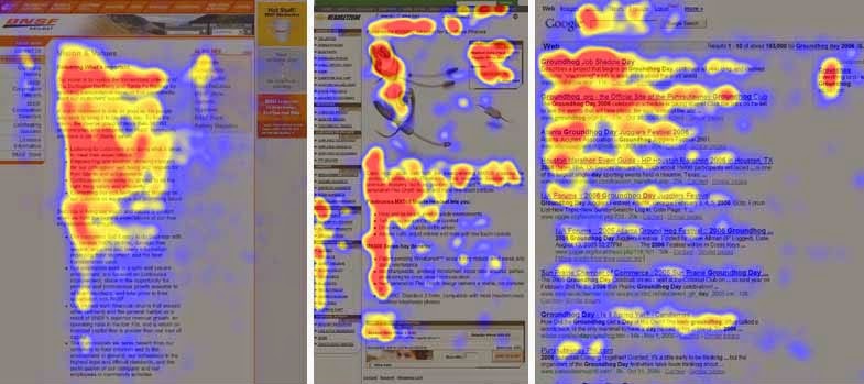
People read webpages in the shape of an "F". The details can be found on this website - When visitors reach the bottom, DON'T leave them on their own to figure out what to do next. Give them a navigation button that takes them to the next page you want them to read.

Don't leave them stranded at the bottom of the page. Take them to the next page
Anything you put online becomes part of "the record". It will be read by your opponents. Make sure that everything that goes up on your website can be verified from other sources and information!
Time to start writing!
Next up? e-Mails and e-Blasts - A Campaign's Key Communications Tool. See you on the next post.
PS - Sorry about violating my own rules about webpage length. I started writing and got carried away. In spite of the length, I hope you find the information useful.
PPS - I subscribe to an e-zine from On-Line Candidate. They offer very important campaign tips and it's all free. Why not subscribe?
P3S - Another e-zine that you might be interested in is "Site Pro News". They have weekly tips, tricks and information on what's going on in the website world, what Google's search engines are up to and a whole lot more. This link is right in line with creating your own website - "Does Your Content Stink?" If you aren't subscribed, your webmaster definitely should be!